When Adam and I started working on Land-Grant a little more than nine years ago, we knew that design would be an important aspect that would set us apart from other breweries. From the stories we’d be able to communicate, the memories we’d be able to recall, and the attention we’d be able to grab through design (both visual and experiential) – we knew that would be what would set our great beer ahead of any other brewery’s great beer. The quality of the liquid in the glass is paramount, but the craft beer drinker wants more than just what’s in the glass. They want the details – the peek behind the curtain, the backstory, to be in on the joke, to be accepted inside the world of the brewery – and most importantly, made to feel welcome.
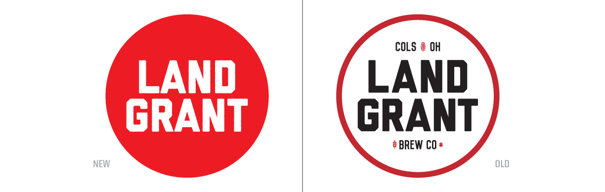
We launched our brewery with a strong brand identity, one that was forged and refined over a two+ year planning and building stage; one that allowed us to get our beer on grocery and retail shelves just as those shelves were reaching capacity. Seven years of growth, a lot of figuring it out on the fly DIY, more than a few last-second branding applications, and nearly ~240 distinct beer brands later…we’re entering 2022 with a reimagined visual language built to refine, refresh, and improve the consistency of our communication.
In late 2021, we sat down and took a look at Land-Grant’s core principals, what we wanted to focus on and where we wanted the Land-Grant brand to go. It did not take long to identify four key pillars of Land-Grant that have driven our business all along: Quality, Community, Sustainability, and Education.
From there, we identified two guiding mantras:

“All Welcome” and “We Make Beer for You” encompass our belief that craft beer, and the taproom + beer garden we’ve built around it should create an atmosphere of hospitality. A literal and figurative place where anyone can come through our door and have a memorable, exciting, educational, and, well, fun experience. We pride ourselves on being free of gatekeepers, on genuinely hoping everyone who walks through the door finds their new go-to beer (whether that’s a hazy, a lager, a sour, or a stout), and on being welcoming to all members and groups in our community. It’s beer; it should be fun and inclusive.
Rooted in this refocused ethos for Land-Grant, we knew it was time to take a look at everything we’ve created over the last nine years (logos, labels, posters, social graphics, business cards, stickers, case trays, sales materials…you name it!) and work to align it all. We embraced the opportunity to simplify, eliminate distraction, improve legibility and function – all without sacrificing the fun and unique character of each beer we make and the equity of this brand we love.
Below, you’ll find examples of several of our refreshed brand elements – including a look at our updated label design, collateral components, and some promotional pieces you may (or may not) eventually see out in the real world. It has been a lot of fun to work on, and we’re all very excited to introduce it to you as it makes its way outside the walls of our offices.
Can Labels
![]()
It’s pretty safe to say that the element most people experience our brand through is the label on our cans. As you can see above—as illustrated by our first canned seasonal beer, Beard Crumbs—things have evolved quite a bit over the years. We’ve worked to maximize the label real estate dedicated to the brand art, while also trying to improve legibility and access to the most relevant information for our customers. One of the biggest changes we’ve made in this newest iteration is the evolution away from a paragraph of descriptive text to a more flavor- and ingredient-focused description. Along with a more visible ABV designation, customers will be able to quickly and accurately gauge exactly what the beer in the can tastes like.


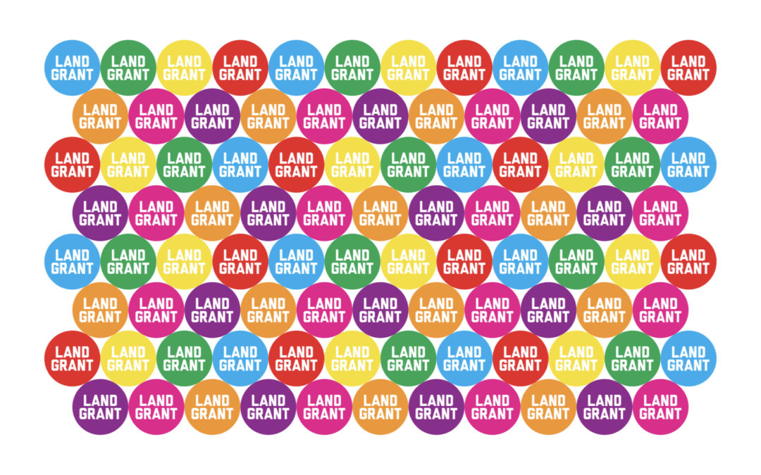
Brand Elements
Each of our secondary logos and other brand elements has been redrawn and refined in support of our main logo for use across everything from merch to invoices. These elements help round-out our brand and offer flexibility based on the applications in which they will be used.

Brand In Use
We know our brand does not exist in a vacuum, nor does it exist solely on your screen; it exists in the real world. With that lens, we carefully considered the various applications our brand might take on beyond the beer labels. From posters and billboards, to glassware, hats and patches… it is vital the refreshed elements work across all of these platforms.


